The Matrix of Anomalies is a scatter chart that visualizes the anomalies from the logs analyzed by LogPoint UEBA. The chart displays time-range along the X-axis and Risk Scores along the Y-axis. Additionally, it shows multiple scatter points color-coded by their threat type. Each point indicates that one anomaly is present. You can view the matrix of anomalies chart for each entity from their tab in the UEBA page. You can view the individual entity tab only if there are any anomalies generated for the entity.
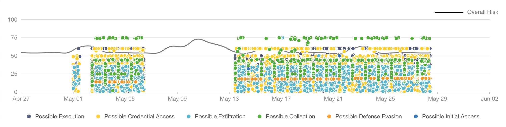
Overall Risk Trend in the Matrix of Anomalies Chart
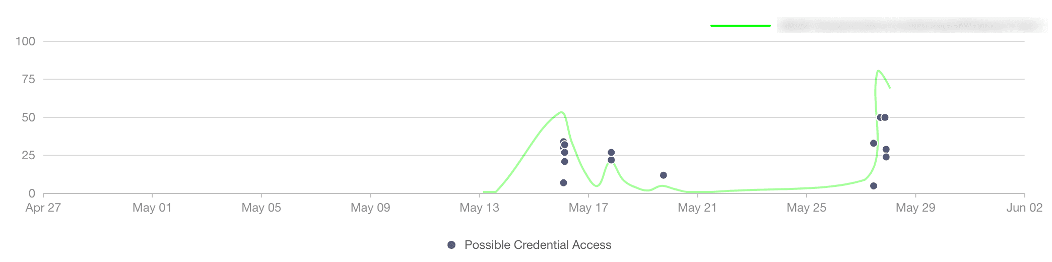
Entity Risk Trend in the Matrix of Anomalies Chart
The chart also includes the overall risk trend and the entity risk trend. The entity risk trendline is based on the latest entity selected. You can view the risk trendline for each entity by selecting at least one day from the date-range.
The chart legend lists all the threat types associated with the entity. By default, all the threat types are selected. You can deselect threat types to remove the anomalies associated with them from the chart.
If you hover on the chart on any scatter point, it displays entity name, anomaly risk score, threat type, anomaly risk category, and entity risk score.
You can zoom in on a specific time-range or anomaly risk score by dragging the ( ) scatter brush on the chart. Once you select a range, the anomalies list shows anomalies from the selected range only. You can reset the chart by clicking the Reset button.
Note
The matrix of anomalies has an internal limit of 30000 anomalies by default.